The work
Example data visualizations from some of the projects I worked on, along with their what, why and how aspects
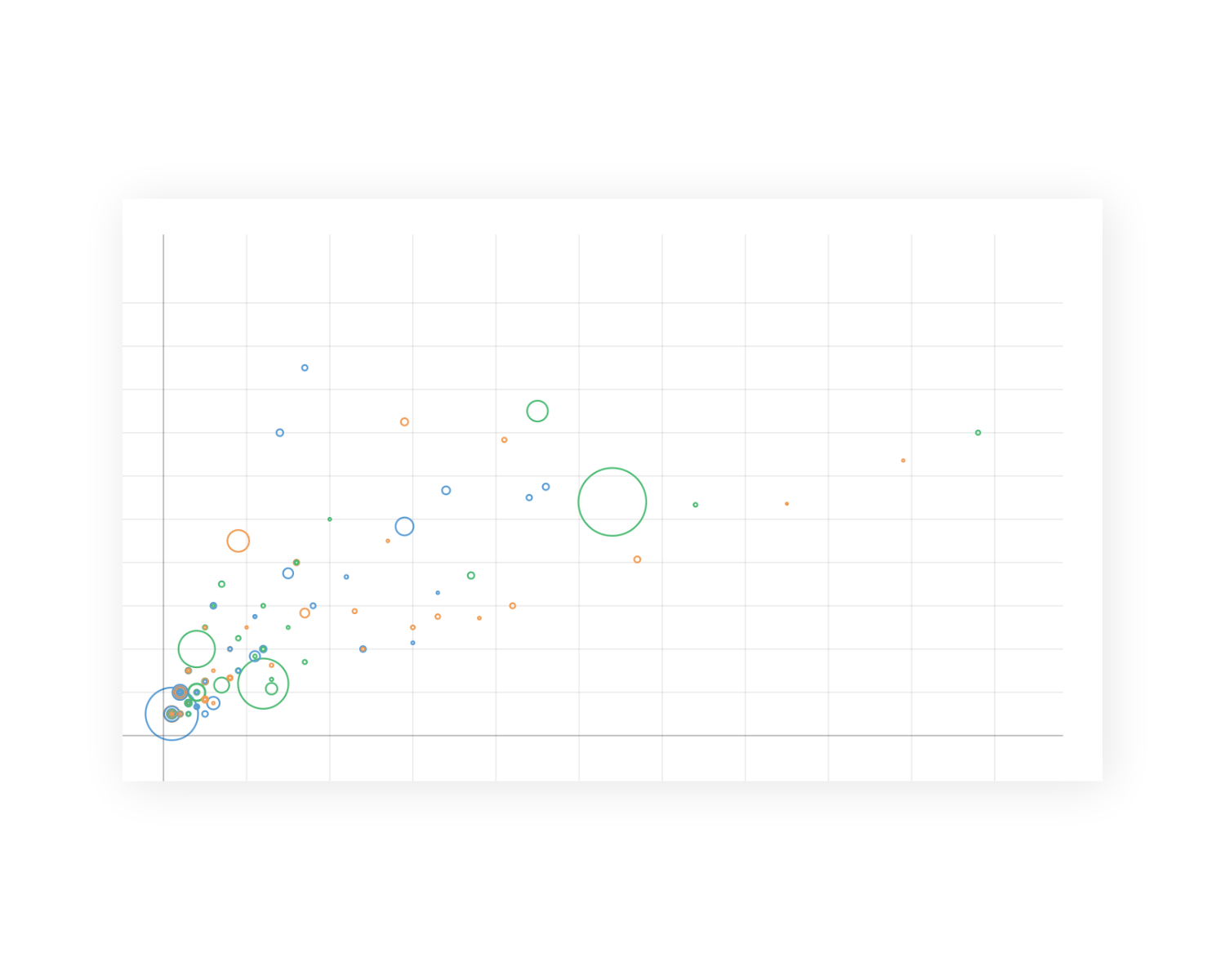
Interactive Bubble Plot - UK Economy Segmentation
What
An interactive bubble plot that shows segmented companies in the UK economy and their marketing metrics
Why
Provides users with functionality to explore their total addressable market and ideal customer profile along with their various marketing campaign engagement levels
How
Observable, JavaScript, Observable Plot
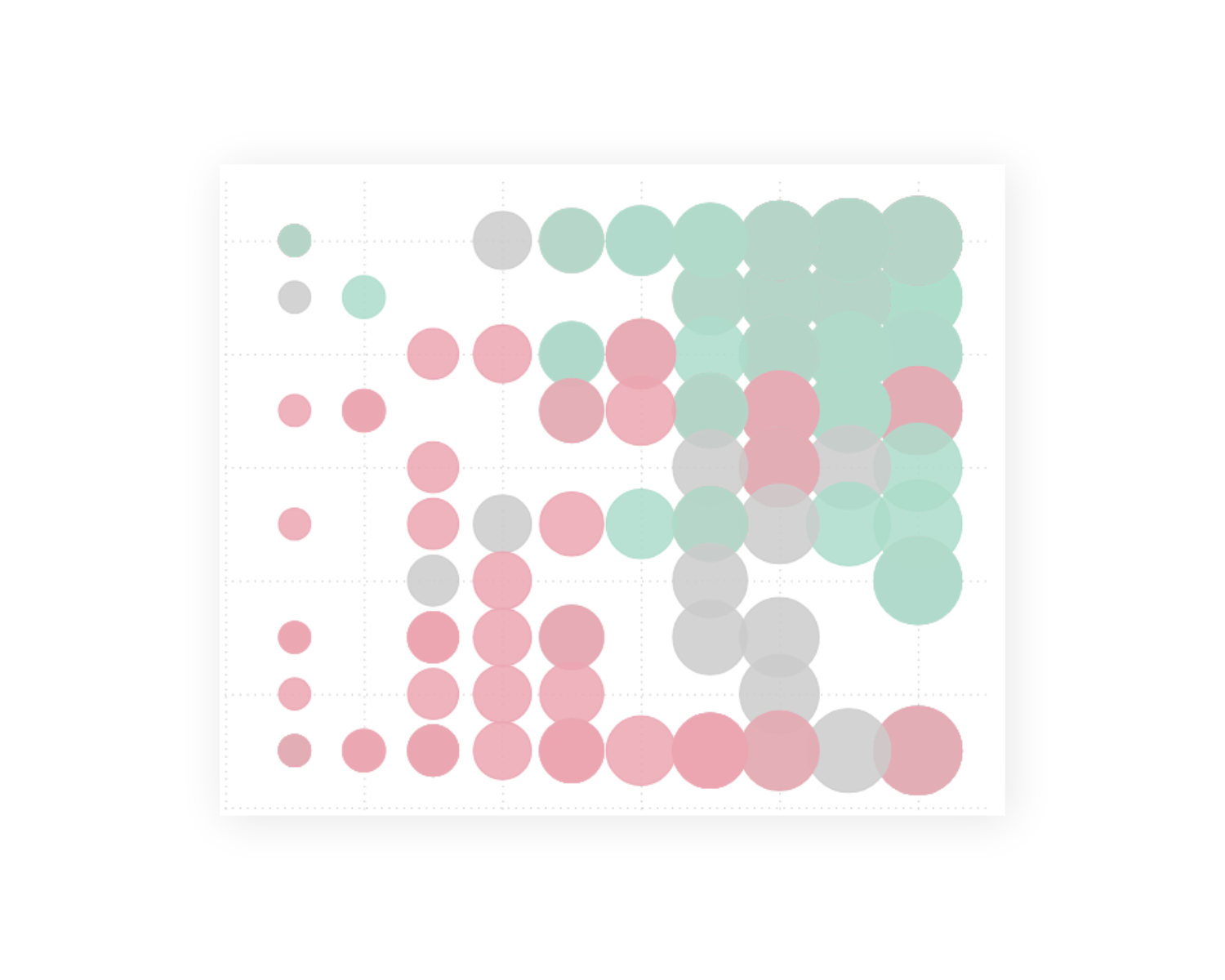
Net Promoter Score Survey Dashboard
What
An interactive bubble plot that shows results of a Net Promoter Score survey in the customer level
Why
Provides users with a functionality to explore their customers' satisfaction level based on a variety of questions answered
How
Microsoft PowerBI
Weekly Intensity Heatmap
What
An interactive heatmap that shows selected events in a week day versus day time interval matrix.
Why
Provides users with functionality to explore weekday / day time interval pairs with the rest of the report responding to the selection.
How
Microsoft PowerBI

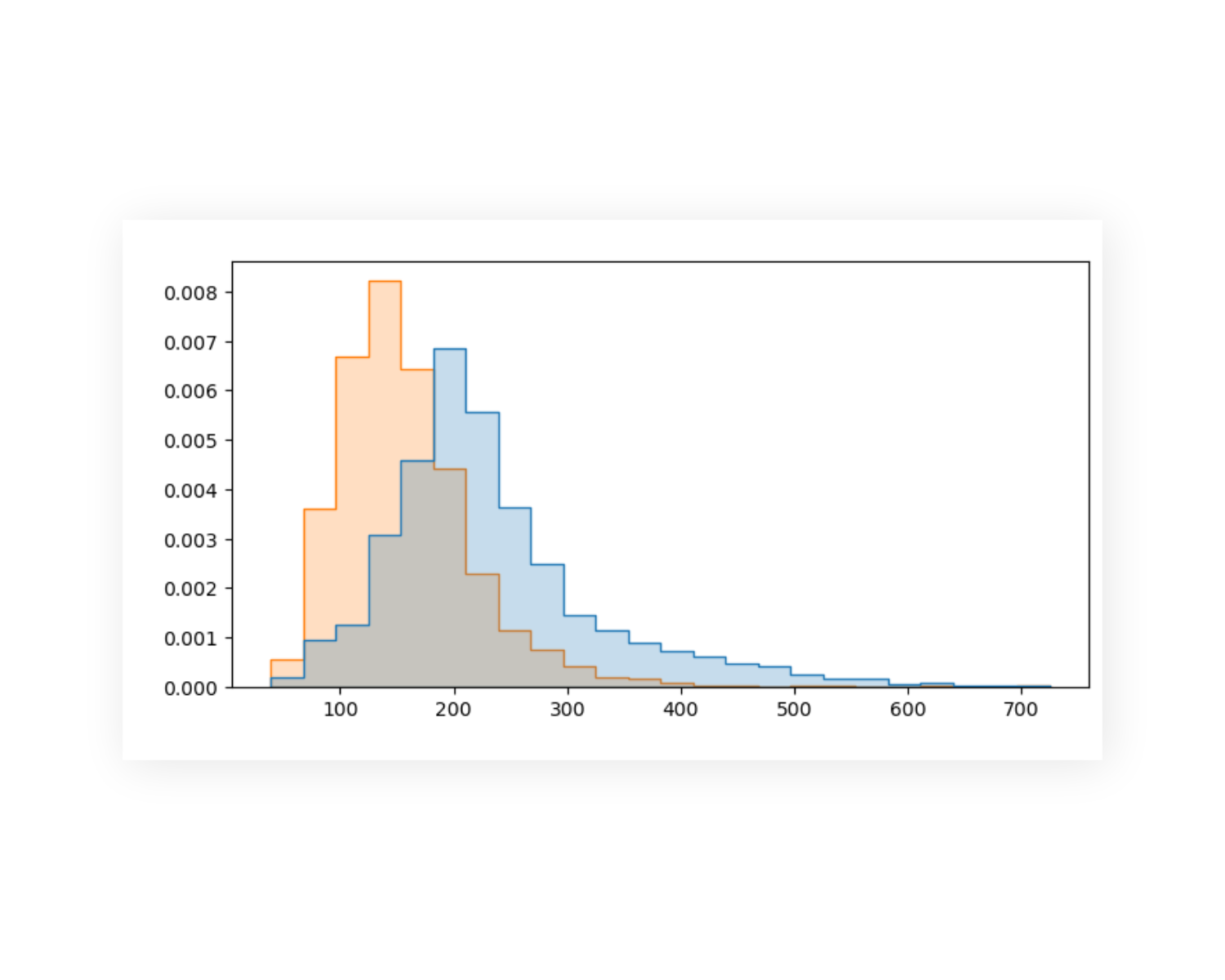
Time Period Distribution Analysis
What
A static histogram that shows the distribution of different time periods in the same data
Why
Provides viewers with a comparison of displayed categories as well as detailing the distribution of each
How
Jupyter Notebook, python, seaborn
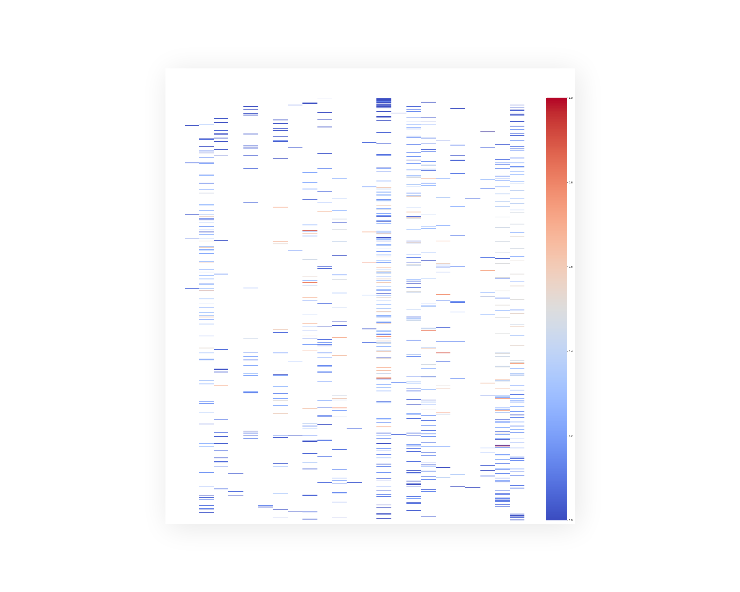
Marine Transportation Timetable Heatmap
What
A static heatmap that shows the departure times of a marine transportation service timetable in a desired time period
Why
Provides viewers with a perception of how the most important departure times are spread based on the journey occupancy of the vehicles
How
Jupyter Notebook, python, seaborn
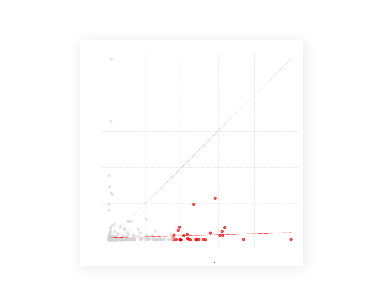
Normalised Comparison & Correlation Analysis
What
A static scatter plot that highlights the desired category and de-emphasizes the rest of the data points by reduced opacity and gray color selection along with the 1:1 and linear regression lines.
Why
Provides viewers with a sense of model comparison and how the desired category performs in the model compared to rest of the data points.
How
Jupyter Notebook, python, matplotlib
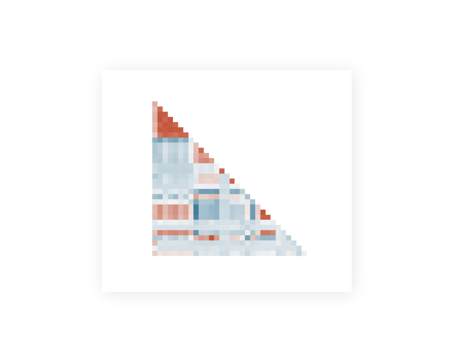
Machine Learning Correlation Analysis
What
A static heatmap that shows the correlation between independent and dependent variables to be used in a machine learning model
Why
Provides viewers with an understanding of which independent variables have the highest correlation with the dependent variable and a potential multicollinearity between independent variables
How
Jupyter Notebook, python, seaborn
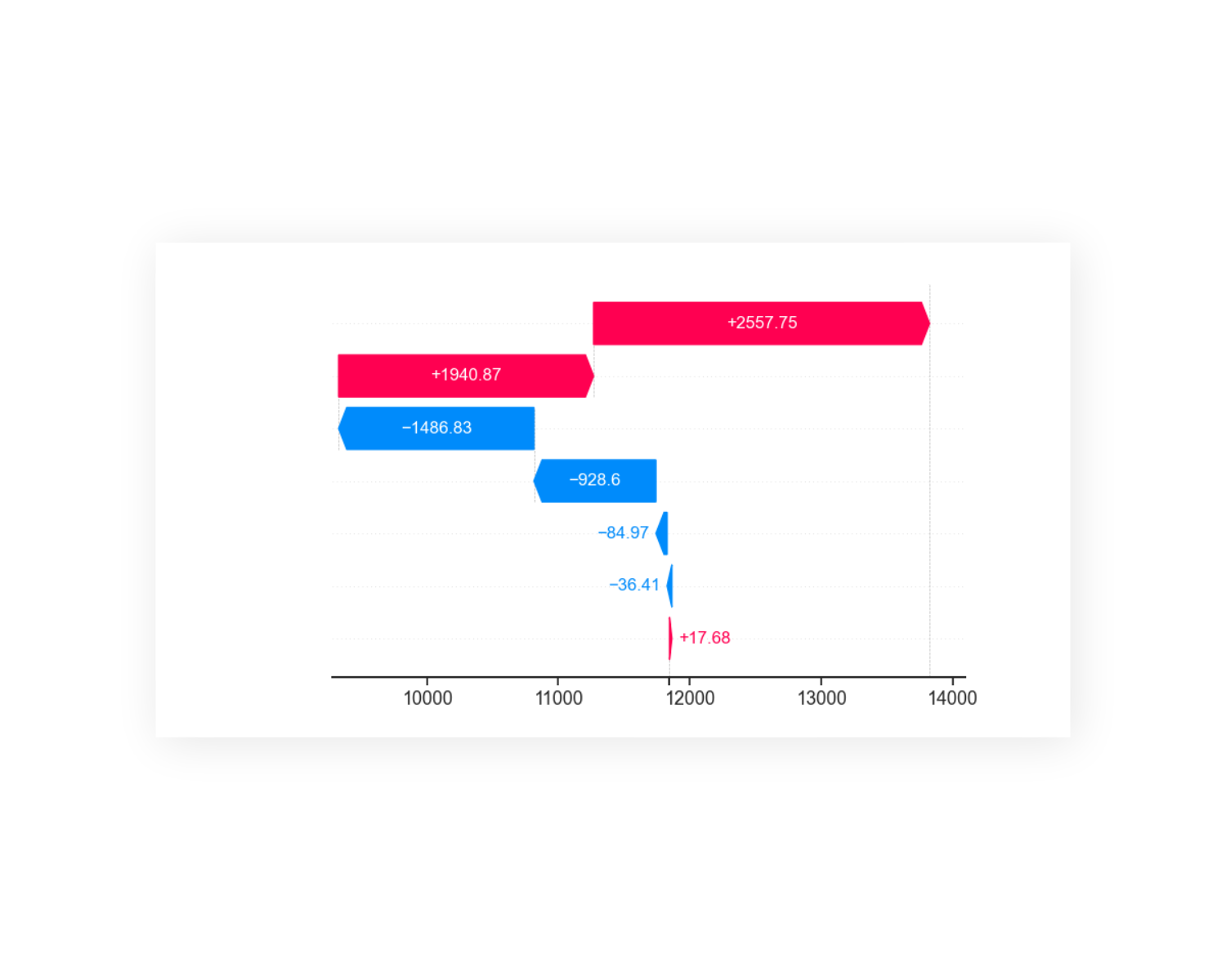
SHAP Values for Individual Predictions
What
A static bar plot that shows the SHAP values for each feature used in a machine learning model for an individual prediction
Why
Provides viewers with an understanding of how each and every feature impacts the model output of a single (local) prediction
How
Jupyter Notebook, python, shap
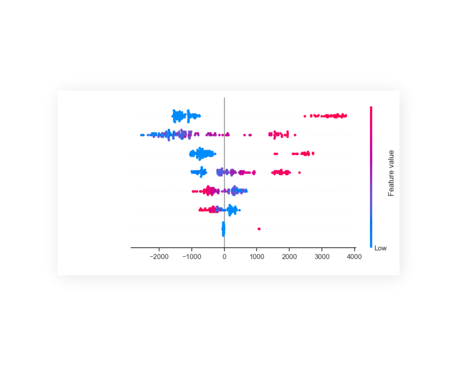
SHAP Beeswarm Plot for Model Features
What
A static beeswarm plot that shows an information-dense summary of how the top features in a dataset impact a machine learning model's output
Why
Provides viewers with a sense of which features influences the model output in average, what the scale of the impact is and how it impacts: either positive or negative
How
Jupyter Notebook, python, shap
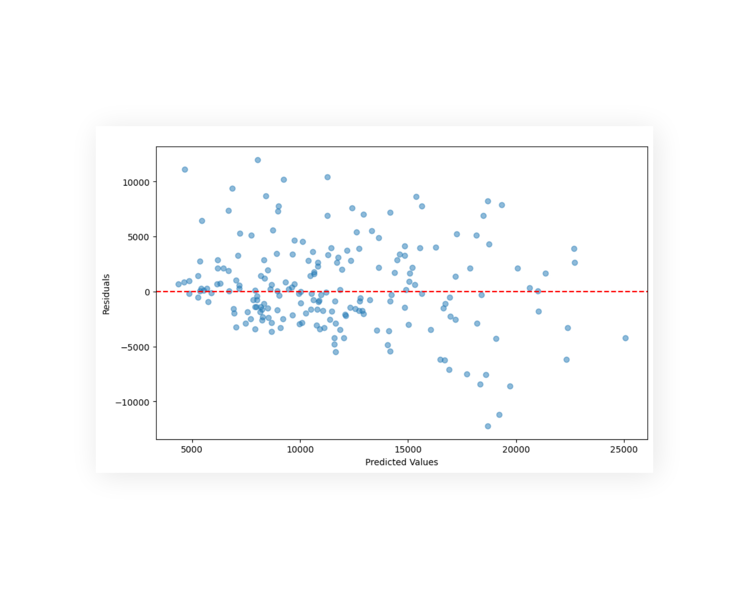
Model Performance Residual Analysis
What
A scatter plot that magnifies the difference between actual and predicted values of a machine learning model
Why
Helps viewers assess the quality of a machine learning model by examining the differences (residuals) between actual and predicted values
How
Jupyter Notebook, python, sklearn
Interested in the details?
Get in Touch